Market News May 4, 2022

Q1 2022 Western Washington Real Estate Market Update

The following analysis of select counties of the Western Washington real estate market is provided by Windermere Real Estate Chief Economist Matthew Gardner. For further information about the housing market in your area, please don’t hesitate to contact met. Big thanks to Matthew Gardner and the Windermere staff or getting this updates out for us to stay current with what’s going on in our area.


Regional Economic Overview

The post-COVID job recovery continues. Though data showed the number of jobs dropped in January, February saw gains that almost offset the jobs lost the prior month. As of February (March data is not yet available), the region had recovered all but 47,000 of the more than 300,000 jobs lost due to the pandemic. Of note is that employment levels in Grays Harbor, Thurston, San Juan, and Clallam counties are now above their pre-pandemic levels. In February, the regional unemployment rate rose to 4.1% from 3.7% in December. Although this may be disconcerting, an improving economy has led more unemployed persons to start looking for a job, which has pushed the jobless rate higher. I expect the regional economy to continue expanding as we move into the spring and summer, with a full job recovery not far away.

Western Washington Home Sales

❱ In the first quarter of 2022, 15,134 homes sold, representing a drop of 5.8% from the same period a year ago, and down 31.7% from the fourth quarter.

❱ Yet again, supply-side constraints limited sales. Every county except Snohomish showed lower inventory levels than a year ago.

❱ Sales grew in five counties across the region but were lower across the balance of the counties contained in this report. Compared to the fourth quarter, sales were lower across all market areas.

❱ The ratio of pending sales (demand) to active listings (supply) showed pending sales outpacing listings by a factor of 6.7. Clearly, the significant jump in mortgage rates in the first quarter has not yet impacted demand. Rather it appears to have stimulated buyers partly due to FOMO (Fear of Missing Out)!
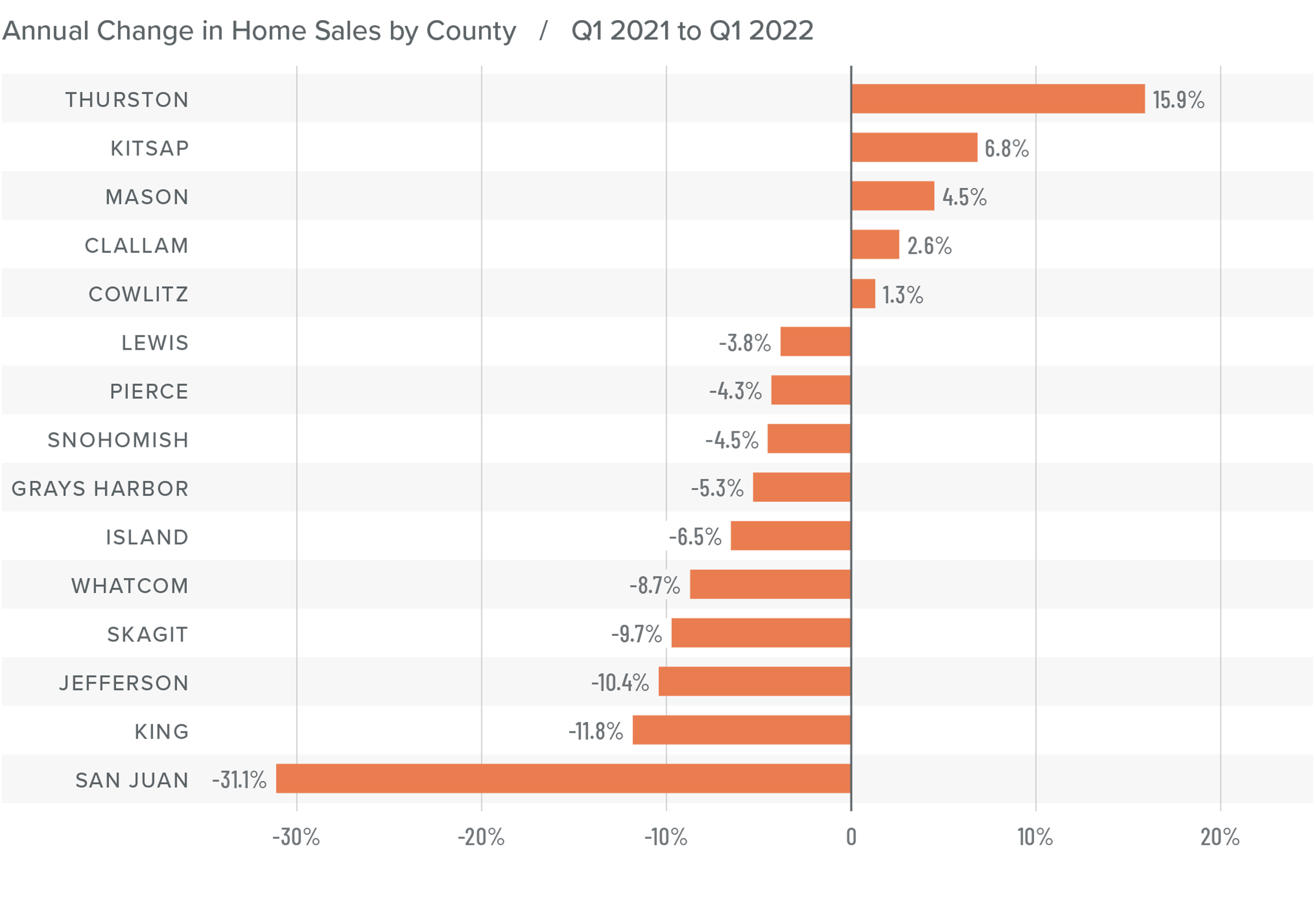
A bar graph showing the annual change in home sales for various counties in Western Washington between Q1 2021 and Q1 2022.

Western Washington Home Prices

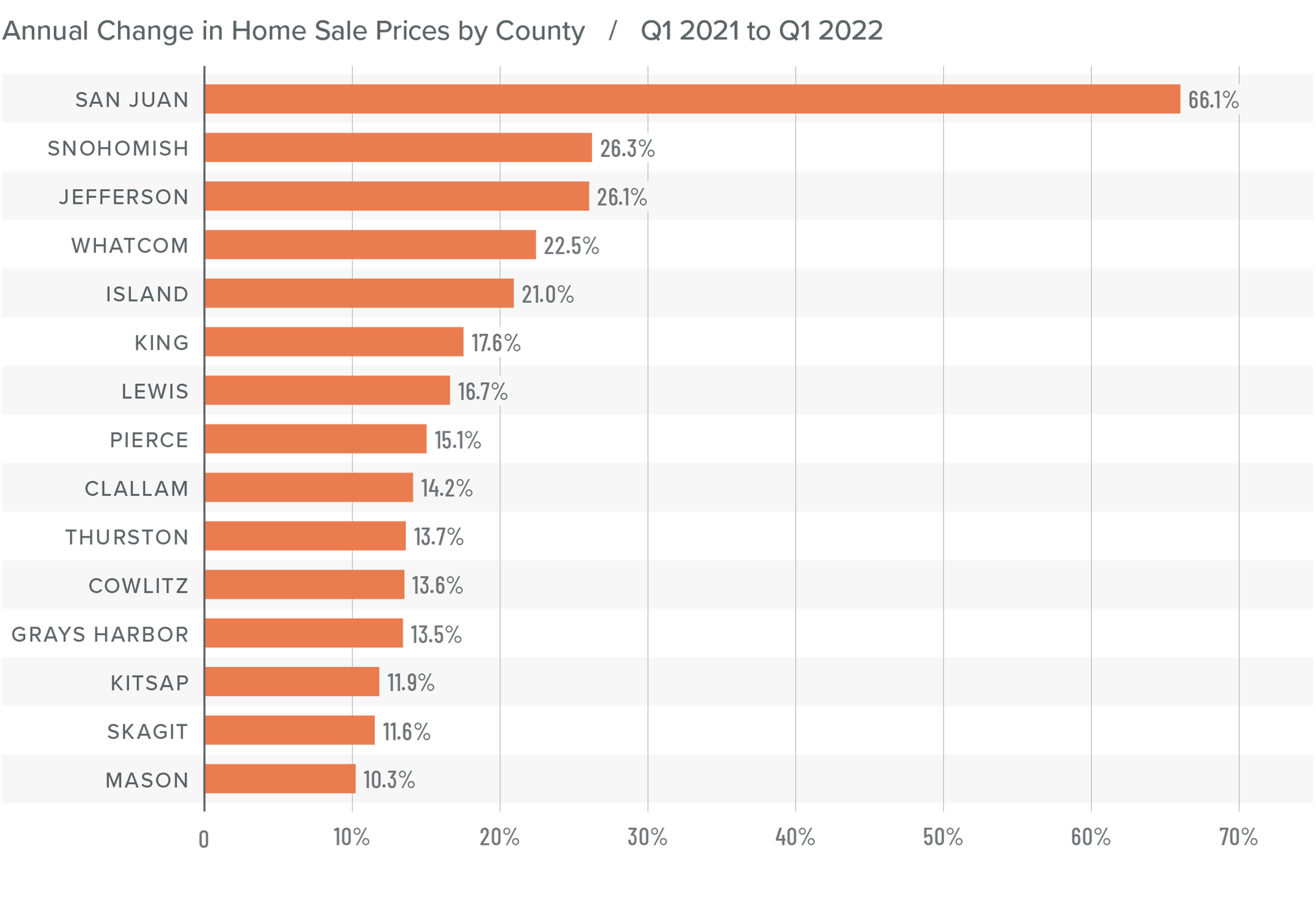
❱ Although financing costs have jumped, this has yet to prove to be an obstacle to buyers, as prices rose 16.4% year-over-year to an average of $738,152. Naturally, there is a lag between rates rising and any impact on market prices. It will be interesting to see what, if any, effect this has in the next quarter’s report.

❱ Compared to the same period a year ago, price growth was again strongest in San Juan County, but all markets saw prices rising more than 10% from a year ago.

❱ Relative to the final quarter of 2021, all but Kitsap (-2.7%), Mason (-1.5%), Skagit (-1.8%), Jefferson (-6.3%), and Clallam (-0.1%) counties saw home prices rise.

❱ The market remains supply starved. While increases in “new” listings suggest that more choice is coming to market, it remains insufficient to meet demand.
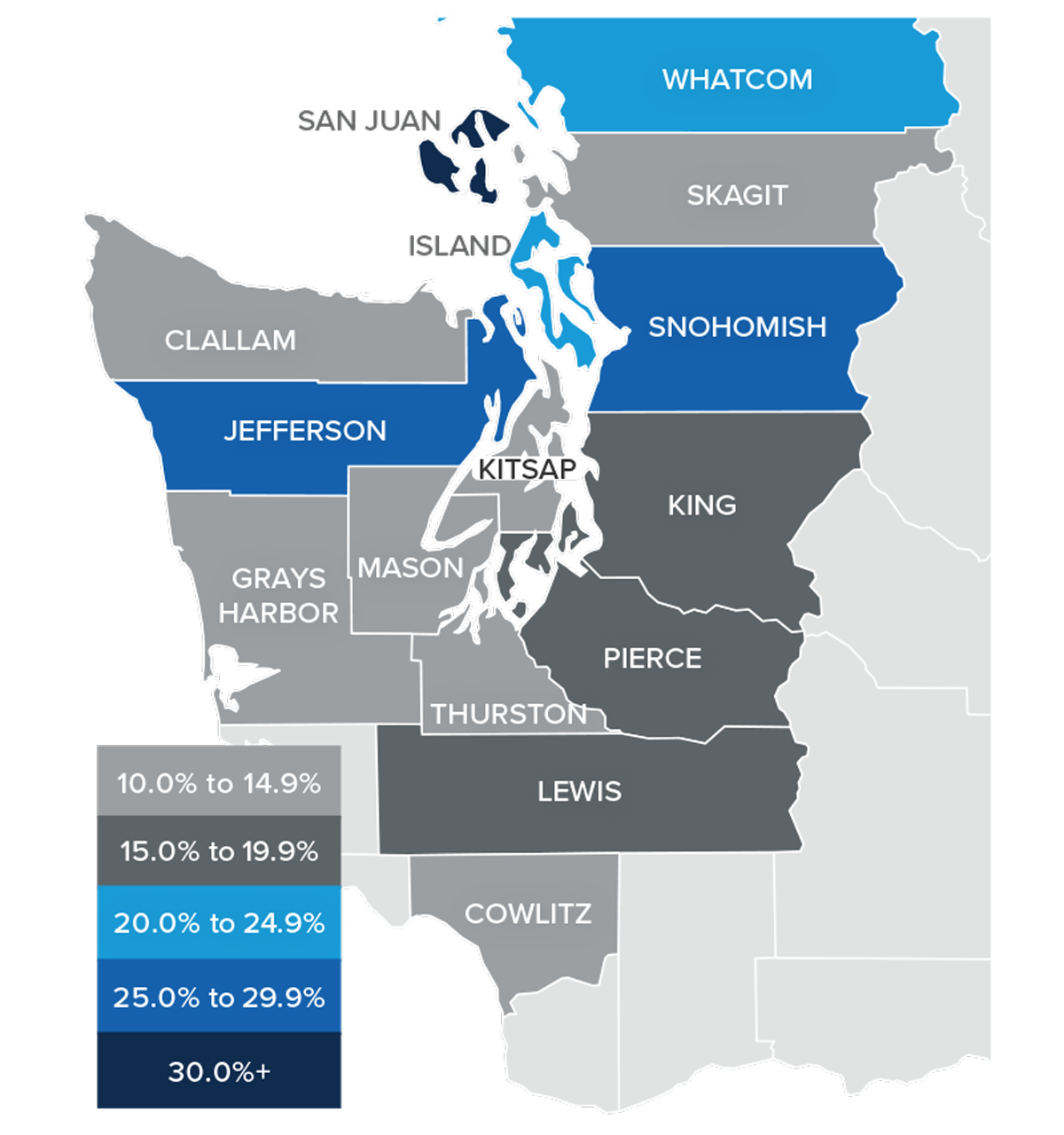
A map showing the year-over-year real estate market percentage changes in various counties in Western Washington for Q1 2022.

A bar graph showing the annual change in home sale prices for various counties in Western Washington from Q1 2021 to Q1 2022.

Mortgage Rates

Average rates for a 30-year conforming mortgage were 3.11% at the end of 2021, but since then have jumped over 1.5%—the largest increase since 1987. The surge in rates is because the market is anticipating a seven- to eight-point increase from the Federal Reserve later this year.

Because the mortgage market has priced this into the rates they are offering today, my forecast suggests that we are getting close to a ceiling in rates, and it is my belief that they will rise modestly in the second quarter before stabilizing for the balance of the year.
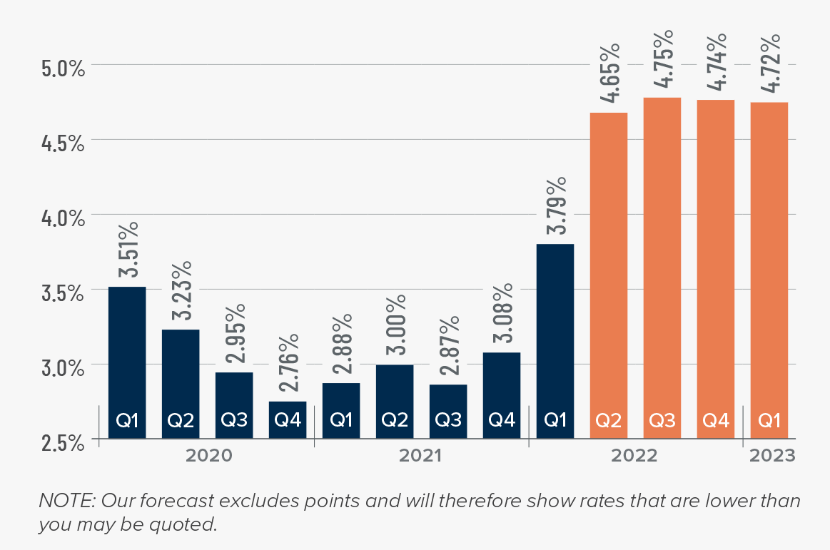
A map showing the real estate market percentage changes in various counties in Utah during the third quarter of 2021.

Western Washington Days on Market

❱ It took an average of 25 days for a home to go pending in the first quarter of 2022. This was 4 fewer days than in the same quarter of 2020, but 2 days more than in the fourth quarter of 2021.

❱ Snohomish, King, and Pierce counties were the tightest markets in Western Washington, with homes taking an average of 11 to 15 days to sell. The greatest drop in market time compared to a year ago was in San Juan County, where it took 23 fewer days for homes to sell.

❱ All but five counties saw average time on market drop from the same period a year ago, but the markets where it took longer to sell a home saw the length of time increase only marginally.

❱ Quarter over quarter, market time dropped in Snohomish, King, and Pierce counties. Jefferson and Clallam counties also saw modest improvement. In the balance of the region the length of time a home was on the market rose, but seasonality undoubtedly played a part.
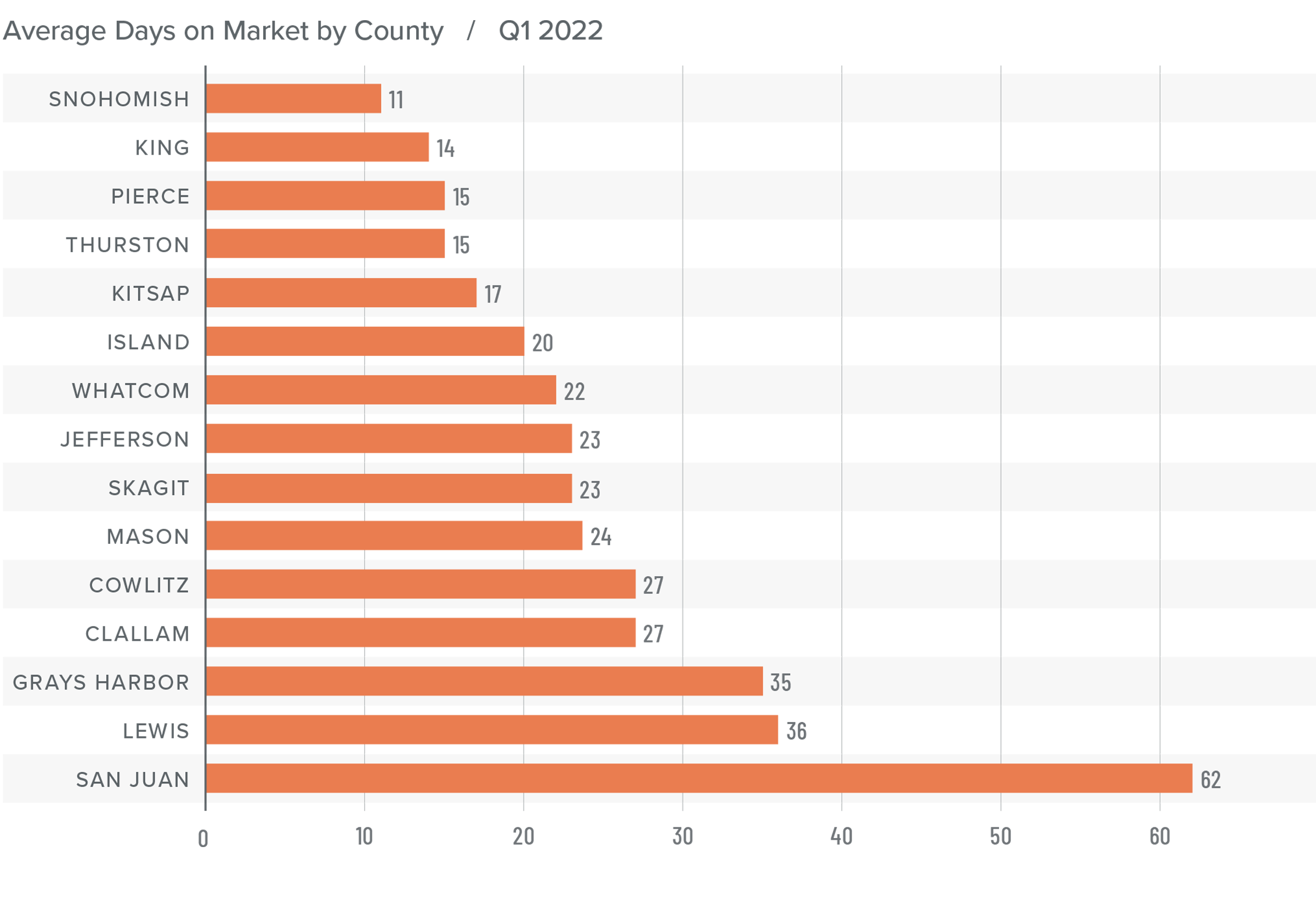
A bar graph showing the average days on market for homes in various counties in Utah during the third quarter of 2021.

Conclusions

This speedometer reflects the state of the region’s real estate market using housing inventory, price gains, home sales, interest rates, and larger economic factors.

The numbers have yet to indicate that demand is waning amid rising interest rates, but this is sure to become a greater factor as we move into the spring. A leading indicator I pay attention to is changes to list prices and, in most counties, these continue to increase. This suggests that sellers remain confident they will be able to find a buyer even in the face of higher borrowing costs. If this pace of increase starts to soften, it may be an indication of an inflection point, but it does not appear to be that way yet.
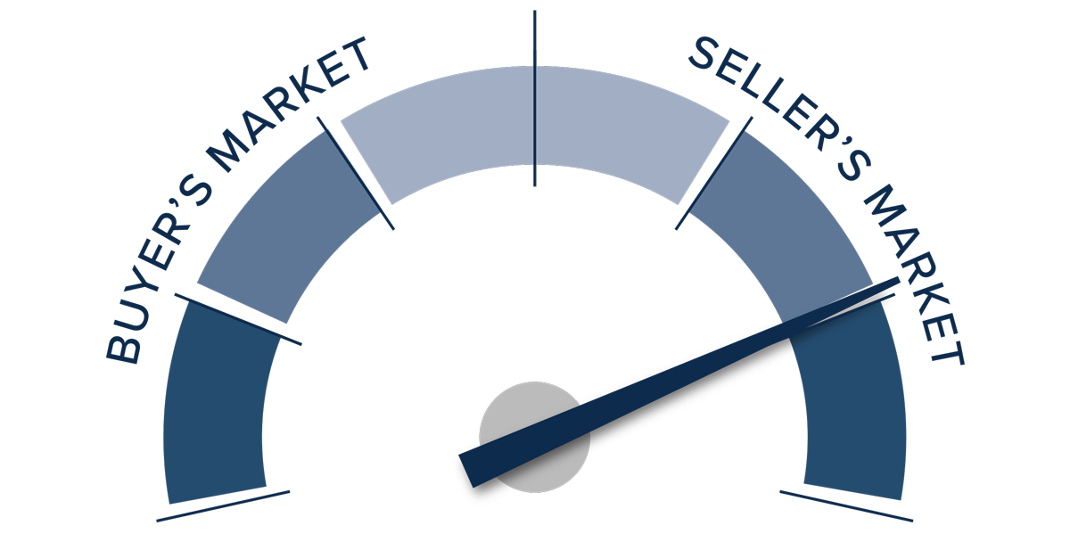
A speedometer graph indicating a seller's market in Western Washington during Q1 2022.

Given all the factors discussed above, I have decided to leave the needle in the same position as the last quarter. The market still heavily favors sellers, but if rates rise much further, headwinds will likely increase.

About Matthew Gardner

Matthew Gardner - Chief Economist for Windermere Real Estate

As Chief Economist for Windermere Real Estate, Matthew Gardner is responsible for analyzing and interpreting economic data and its impact on the real estate market on both a local and national level. Matthew has over 30 years of professional experience both in the U.S. and U.K.

In addition to his day-to-day responsibilities, Matthew sits on the Washington State Governors Council of Economic Advisors; chairs the Board of Trustees at the Washington Center for Real Estate Research at the University of Washington; and is an Advisory Board Member at the Runstad Center for Real Estate Studies at the University of Washington where he also lectures in real estate economics.

Market News March 28, 2022

Blockchain Technology and Cryptocurrencies in Real Estate

This video is the latest in our Monday with Matthew series with Windermere Chief Economist Matthew Gardner. Each month, he analyzes the most up-to-date U.S. housing data to keep you well-informed about what’s going on in the real estate market. A big thank you to Matthew Gardner and the Windermere staff for getting updates like this out so we can stay informed.


Hello there, I’m Windermere Real Estate’s chief economist, Matthew Gardner, and welcome to the latest episode of Mondays with Matthew. This month we’re going to take a look at Blockchain technology and cryptocurrencies themselves and how both may impact home buyers and sellers in the future.

But before we dive into the potential impacts of cryptocurrency on the residential housing market, I must preface this by saying that the very word “crypto” is one that certainly divides people. Some see it as revolutionary, a tangible asset that will take over one day as the de-facto global currency, while others believe it to be unsustainable and ultimately valueless. And there are even some who firmly believe that it’s nothing more than a Ponzi scheme.

Now, everyone is certainly entitled to their opinion, and I will refrain from offering my own view on the currencies themselves, but, although still in its infancy, it continues to evolve and is garnering significant interest from individuals and large corporations alike.

Why are corporations interested, you ask? Well, a recent report from Crypto.com1 put the number of people around the globe who own some form of cryptocurrency at more than 295 million and they are forecasting this number to explode this year and hit the 1 billion mark! And the value of all these currencies today? As of March 14, the combined value of all cryptocurrencies was 1.74 trillion dollars2 with the largest, Bitcoin, valued at almost 740 billion dollars. So, it should not be a surprise to see many mainstream companies across multiple industry sectors start to introduce ways to accept crypto as payment for goods and services.

Companies moving into this space include AMC movie Theaters3 who recently announced their plan to accept coins by the end of this year. Fintech companies like Paypal and Square are also betting on crypto by allowing users to buy currency on their platforms. And, unsurprising to most, Tesla is also interested, but have yet to confirm whether they will accept coins as payment for their vehicles or not.

With cryptocurrencies now gaining traction in mainstream businesses, the housing sector has started to take an interest too with the emergence of companies like Propy, whose goal is to totally automate the home sales process by introducing Blockchain based technology to allow transactions to occur entirely online using smart contracts. Other companies are figuring out how to use blockchain technology to grow the “fractional-ownership” segment of the housing market.

But when it comes to simply buying a house—well that is an entirely different situation. Of course, a home buyer could easily cash out the Crypto they have and use those funds for a down payment, or even to buy a house outright. But we don’t see more of this today as they understand selling their currency is a taxable event and, more than likely, taxes owed will hit their balance sheets pretty hard. And knowing that this is a real issue in the market, it should come as no surprise that a company has come up with a plan to overcome what is seen as one of the biggest obstacles to using digital currency for home buying.

Blockchain Technology and Cryptocurrencies in Real Estate

A slide introducing the cryptocurrency-based real estate company Milo and how their transactions work.


And they are Milo, who claim to offer the world’s first “crypto-mortgage”. Essentially, they will allow borrowers to use Bitcoin—but only Bitcoin as of right now—as collateral for a 30-year mortgage.

How this works is pretty simple. All buyers have to do is to “pledge” their coins on a one-for-one basis. Simply put, someone looking for a $500,000 mortgage would have to put up $500,000 worth of Bitcoin. This way, they don’t actually have to sell their coins, so there are no tax implications. And instead of going through a FICO credit check and showing proof of income to evaluate a borrower’s creditworthiness, Milo evaluates them based on their crypto wealth as well as the value of the property they are hoping to buy.

And in exchange for locking up their crypto, borrowers get a 30-year mortgage for their home purchase can also make their mortgage payments via traditional currency or Bitcoin. But there are differences between this and a traditional mortgage. First off is the interest rate. It currently ranges anywhere from 5 to 8% depending on the loan-to-value ratio. This is higher than the rate they could get today.

And the interest rate is not fixed, but variable, and based on the prevailing price of Bitcoin. The rate can go up or down depending on the value of the Bitcoin they have pledged, and this mortgage rate will be adjusted every year. Interestingly, if the price of Bitcoin goes up, borrowers can actually take back some of their crypto once a year. If the price of Bitcoin goes down, they may be asked to provide more crypto as collateral.

And finally, when the buyer sells, on closing Milo is paid back in U.S. dollars, and then the seller gets the Bitcoins they used for collateral back, along with the profit made on the sale.

I think that this is certainly an interesting play in the ownership housing sector and, although still in its infancy, looks to meet the needs of crypto owners who don’t want to face the tax obligation that would occur if they were to sell their coins to buy a home. Now, I must make clear that Windermere is certainly not endorsing Milo. In fact, I personally have concerns about the program given how volatile cryptocurrencies are.

You see, it is possible that users may be caught out by the value of their Bitcoin dropping significantly and, if this occurs at or around their anniversary date, it could significantly raise the interest rate—and therefore the monthly payment—on that loan, and if the price drops too far, then they may have to go through what is, in essence, a margin call, where they will have to submit more funds to the lender to bring them back to a point where equity in the home combined with the value of the Bitcoin covers the loan itself.

And I would add that if for some reason the buyer has to sell the home within the first three years4 of purchase there are pre-payment penalties that will be incurred. All in all, it is an interesting model, but it is still in its infancy. As always, time will tell how well it gets adopted.

The bottom line for me is that the likelihood of Cryptocurrency revolutionizing the way we buy homes from a finance perspective is still several years away, but after that, who knows! Something that does have the capacity to be adopted into the mainstream far quicker is the blockchain technology itself. I personally see title insurance as a segment that could benefit significantly and may well adopt this tech sooner than others.

With title insurance companies responsible for verifying and ensuring that a buyer or lender (depending on the type of title insurance) gets either clean ownership or a lien position in the land in question, Blockchain could change many aspects of how these processes are carried out. Here are some of the benefits:

The Potential Benefits of Blockchain Technology in Real Estate

A slide showing the benefits of Blockchain technology in real estate transactions, namely added security.


Security. More than 25 percent of title reports (alta.org) detail some form of defect to the title itself, but the ability of blockchain to immediately detect erroneous or potentially fraudulent information can significantly help to support the reliability of the records, therefore making the job of title insurance companies much more straightforward.


A slide showing the benefits of Blockchain technology in real estate, smart contracts, for example.


And then there’s smart contracts, which are actually a form of e-closing that is already beginning to be embraced by some in the industry. This technology makes the transfer of ownership almost seamless. Literally, it would take just a few clicks of a mouse. And this is also a massive benefit for the industry as the closing process would also change dramatically and become far more effortless and less time consuming than today’s standard means of closing on a home purchase.


A slide showing the benefits of Blockchain technology in real estate, improved record-keeping included.


And finally, record-keeping. While fraud and tampering are huge concerns for title companies, blockchain could all but eliminate these instances within ownership records. And, as it would convert land records to a distributed ledger, it cannot be altered within the blockchain itself, therefore making it safe in perpetuity. Blockchain, by design, prevents bad information from disrupting the chain and any attempt to tamper with it can be easily detected and therefore avoided. This is a massive upgrade from the county ledger that title insurance companies find themselves working with today.

No one can deny that Blockchain and cryptocurrencies, while still relatively new, do not appear to be just a flash in the pan. As we have discussed today, a number of companies continue to make inroads into the real estate world. Will some fail? Of course. But others will succeed. So, while still in its infancy, we should all have some sort of understanding of its potential to be a disruptor in the housing space in the future.

It’s my own personal belief that the Blockchain tech itself will be the thing that gets adopted by the real estate world faster than the rise of crypto as a way to buy or finance a home but, whatever your thoughts on this topic are, I think that it is highly unlikely that we will see it simply fade away over time.

As always, if you have any questions or comments about this particular topic, please do reach out to me but, in the meantime, stay safe out there and I look forward to visiting with you all again next month. Bye now.


References:

  1. https://crypto.com/
  2. https://coinmarketcap.com/
  3. https://www.reuters.com/
  4. https://help.milocredit.com/
Market News November 15, 2021

11/15/2021 Housing and Economic Update from Matthew Gardner

This is the latest installment in the Monday with Matthew series with Windermere Chief Economist Matthew Gardner. Each month, he analyzes the most up-to-date U.S. housing data to keep you well-informed about what’s going on in the real estate market. 


Hello there!  I’m Windermere Real Estate’s Chief Economist, Matthew Gardner, and welcome to the latest episode of Mondays with Matthew.

Before I get started, I wanted to let you know that this will be the final episode of Monday with Matthew for 2021 as I’m going to be taking Christmas off. So it’s time to offer you my forecasts for the U.S. economy and the country’s housing market in 2022.

Although many people – including myself – had hoped that COVID-19 would have become a somewhat distant memory by now, and that the economy would have recovered this was – sadly – not to be the case, and the pandemic’s influence on the economy is still being felt and all the datasets I track tell me that, although we are certainly healing, COVID continues to act as a drag on economic growth and I expect that to continue through the spring of next year – if not a little longer.

Economic Recovery & Growth

And it’s because of this that I – along with many other economists – have spent the last few months lowering our forecasts for economic growth – at least through the middle of 2022. So, let’s look at this a little closer.


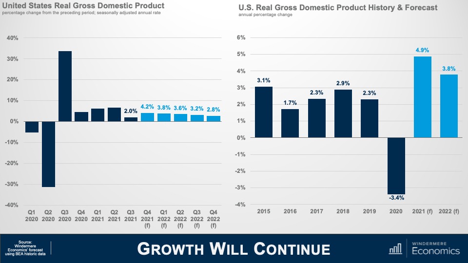
A slide of two bar graphs. The bar graph on the left is titled "United States Real Gross Domestic Product," showing Q1 2020 through Q4 2022 on the x-axis and negative 40 percent to 40 percent on the y-axis. The low GDP was in Q2 2020 around negative 30 percent and the high was Q3 2020 at over 30 percent. The second graph is title "U.S. Rea; Gross Domestic Product History & Forecast," showing the years 2015 through 2022 on the x-axis and negative 4 percent through 6 percent on the y-axis. The lowest annual percentage change was negative 3.4 percent in 2020 and the highest was 4.9 percent in 2021.


Here is my forecast for economic growth through the end of next year and you will note that, even though I am cautious in regard to the economy as we move through the winter and into 2022, I am still expecting to see a fairly decent bounce back in the fourth quarter of this year following the very disappointing rate that we saw in Q-3.

And on an annualized basis, I believe that the economy will have expanded by just shy of 5% this year and come in a little below 4% in 2022.

Simply put, the impacts of COVID-19 are going to continue to act as a drag on virus sensitive consumer services next year and ongoing supply chain issues will also delay inventory restocking. Both of these impacts have a depressing effect, in more ways than one, on economic growth, but I don’t see any chance that we will fall back into a recession.


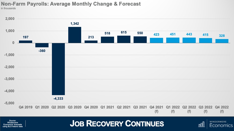
A bar graph titled "Non-Farm Payrolls: Average Monthly Change & Forecast," with Q4 2019 through Q4 2022 on the x-axis and figures in the thousands from negative 5,000 to 2,000 on the y-axis. The low was negative 4,333 on Q2 2020 and the high was 1,342 in Q3 2020.


Looking at the employment picture this chart shows my forecast for average monthly growth in jobs during a quarter and to give you some context, over the last decade or so the country has added an average of around 200,000 jobs per month during any one quarter and my forecast is for more robust employment growth as we move through 2022 and, if correct, I expect to see the country return to pre-COVID employment levels in the second half of the year.


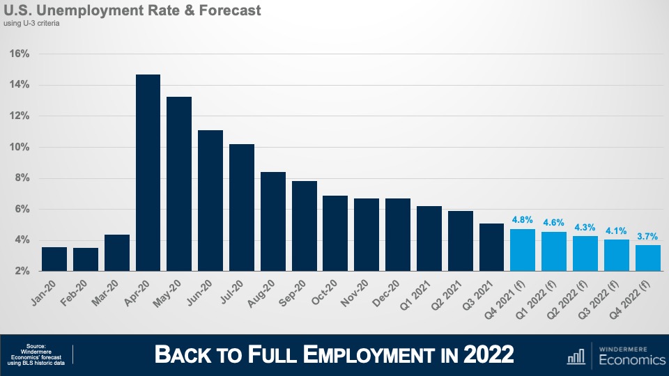
A bar graph titled "U.S. Unemployment Rate & Forecast," showing January 2020 to Q4 2022 on the x-axis and percentage figures on the y-axis, from 2% to 16%. The high was close to 15 percent in April 2020 and the low was just over 3 percent in January and February 2020.


And with jobs continuing to return I’m looking for the unemployment rate to continue trending lower and breaking south of 4% during the final quarter of the year. With the expiration of enhanced unemployment benefits – in concert with wages rising significantly in many face-to-face industries such as leisure and hospitality – prospects for people currently unemployed are looking rather good. That said, there are still millions of unemployed Americans who are not looking for work even with wages rising, the labor force still down by 3 million from its pre-pandemic peak, and this is worrying as businesses continue to have a hard time finding employees which raises the expectation that inflation will remain higher for longer than I would have liked to see.

Measures of Inflation

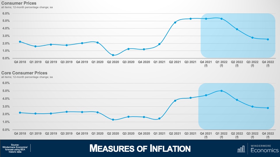
And that leads nicely into my final economic forecast and that is my outlook for inflation. As we have discussed, supply chain issues and labor shortages have increased prices significantly and this top chart shows annual changes in all consumer prices which I expect to remain around 5% until next spring, before gradually dropping down to below 3% by the end of the year.


A slide titled "Measures of Inflation" with two line graphs. One is titled "Consumer Prices" and shows the percentage changes on the y-axis and the quarters from Q4 2018 to Q4 2022 on the x-axis. It shows an expected drop from Q4 2021 to Q4 2022. The "Core Consumer Prices" graphs showing the same measurements on each axis. It shows an expected increase in core consumer prices in Q1 2022 followed by an expected drop toward Q4 2022.


But the core inflation rate – which excludes the volatile food and energy sectors – won’t peak until early next year before it too starts to gradually pull back and, at these levels, the Federal Reserve will undoubtedly have started to raise interest rates to counteract inflationary pressures. This is not pretty, but I absolutely do not believe that we are in some sort of inflationary spiral, or that “stagflation” will raise its ugly head again.


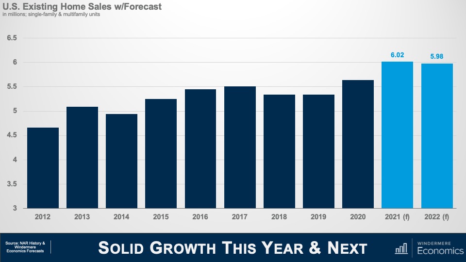
A slide titled "Solid Growth This Year & Next" with a bar graph titled "U.S. Existing Home Sales w/ Forecast." It shows the existing home sales in millions every year from 2021 to 2022. 2021 and 2022 have the highest figures on the graph, at 6.02 and 5.98 million respectively.


U.S. Housing Market

Okay! Now it’s time to turn our attention to the U.S. housing market which was a beacon of hope during the pandemic period and, given the massive spike in demand that started last June, I’m looking for a little more than 6 million existing homes will have changed hands in 2021, but I don’t see this level increasing in 2022 – mainly due to ongoing supply limitations as well as rising affordability issues, and I’m therefore forecasting sales to pull back  – albeit very modestly – next year. That said, the country has never seen more than 6 million home selling in a single year since records were first kept so the number is still very impressive.


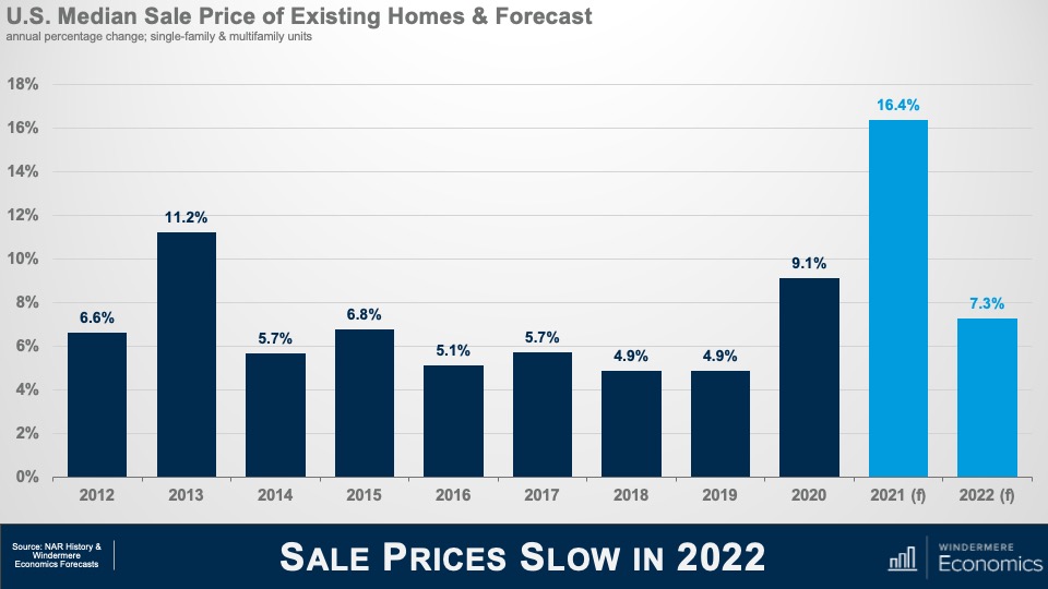
A slide titled " Sales Prices Slow in 2022," with a bar graph titled "U.S. Median Sale Price of Existing Homes & Forecast," which shows the annual percentage change of single-family and multifamily units for the years 2012 through 2022. The highest figure is 16.4 percent in 2021, whereas the lowest in both in 2018 and 2019 at 4.9 percent.


And with the market as tight as it has been so far this year, it shouldn’t be any surprise to see median sale prices skyrocketing and, even though we have 3 more months of sales data yet to be released, I still anticipate prices will have risen by almost 16 and a half % in 2021- a quite remarkable number. This pace of appreciation has never been seen before. In fact, the closest was back in 2005 – when the housing bubble was inflating rapidly – but even then, prices only rose by 12.2%.

But, as I mentioned in my sales forecast, this pace of growth is unsustainable and I am expecting to see some of the heat to come off the market next year but, a growth rate of 7.3% is certainly nothing to sniff at.

There are three major reasons why we will see the pace of growth slow. I have already mentioned my concerns regarding housing affordability, but mortgage rates and new supply will both influence the slowdown in sales and price growth in the resale arena.


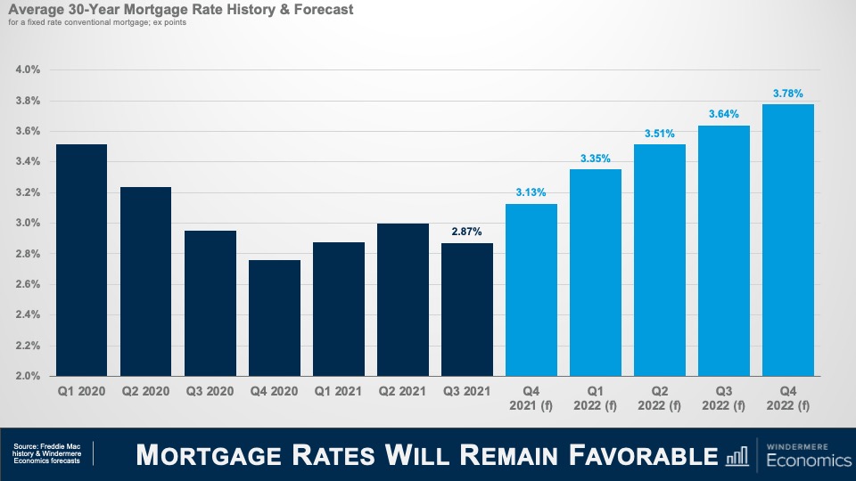
A slide titled "Mortgage Rates Will Remain Favorable" with a bar graph titled "Average 30-Year Mortgage Rate History & Forecast." It shows a predicted increase mortgage rates from Q4 2021 at 3.13 percent to 3.78 percent in Q4 2022.


Although I do not prepare a forecast for housing affordability, this is my where I expect to see mortgage rates through the end of next year and I am looking for them to continue “stair-stepping” higher but still ending 2022 below 4% – very low by historic standards given that the long-term average for a conventional 30-year mortgage is somewhere around 7 1/2%.

Obviously, as rates notch higher that starts to compress price growth as it puts a lower ceiling on how much a buyer can afford to pay for a home.


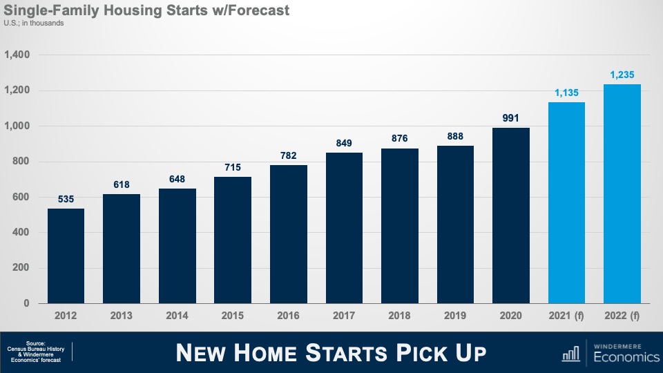
A slide titled "New Home Starts Pick Up," with a bar graph titled "Single-Family Housing Starts w/ Forecast." The graph shows the housing starts in the thousands for the years 2012 through 2022. There is a gradual increase, from 535,000 in 2012 to an expected figure of over 1.2 million in 2022.


And slowing growth in existing home prices and sales will also be a function of additional supply and this chart shows my forecast for single-family starts this year and next. I expect more than a million homes to start construction in 2022 – continuing the trend that started in mid-2020 – but I am sure that some of you may be asking yourselves that if starts are already robust, how have existing home sales been able to increase so significantly if there has been solid supply coming from homebuilders – and that would be a great question.

And I would answer this by telling you that the way the Census gathers data on start is to count the number of home foundations that have been poured, but vertical construction has not necessarily started. And what we have been seeing is a lot of foundations but not so many homes actually being built – and we know this by looking at the number of homes that are for sale but have yet to be started. So, it’s important to look at a separate number that the Census Bureau also puts out which counts the number of units actually under construction, and that number has been growing significantly over the course of the last 18 months or so.


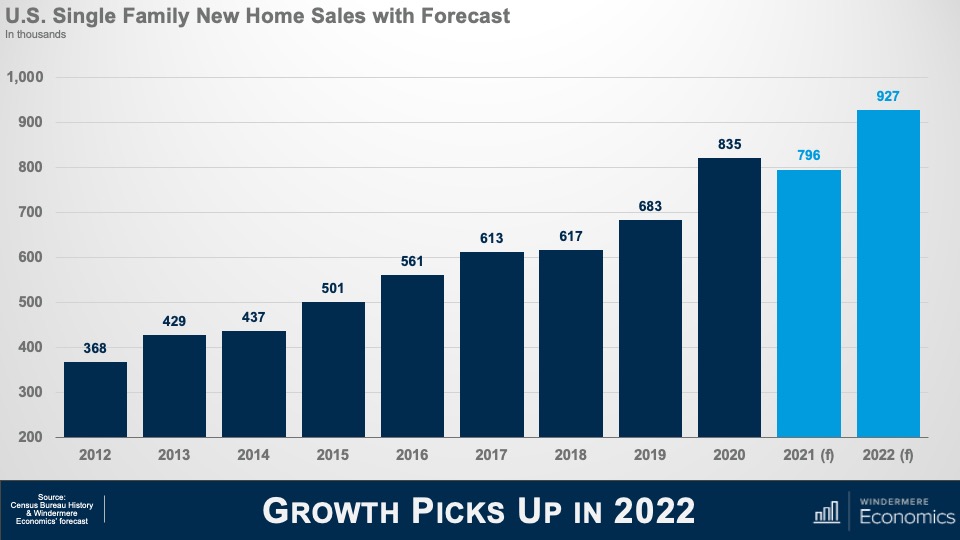
A slide titled "Growth Picks Up in 2022," with a bar graph titled "U.S. Single Family New Home Sales with Forecast." The graph shows the new home sales in thousands for the years 2012 through 2022. Sales were at a low of 368,000 in 2012, jumped to 835,000 in 2020, and are predicted to peak at 927,000 in 2022.


Builders have been hamstrung with rising labor and material costs which will lead new home sales this year to fall below the number seen in 2020; however, I do expect this to pick up significantly next year and my current forecast calls for 927,000 new homes to be sold in 2022.

So, there you have it, my economic and housing market forecast for 2022.

Of course, there are still a number of variables that could lead me to revise this forecast but, as an old economics professor of mine used to tell me, “Gardner, forecast well, but forecast often!”

If everything goes according to my plan, you should expect to see the housing market start to move towards some sort of balance next year, but I am afraid that it will still remain out of equilibrium until at least 2023.

And if you’re wondering, no, I don’t see a housing bubble forming and I’m also not at all concerned about homeowners currently in forbearance, but it would be silly to say that there aren’t any issues in the housing market that concern me because there are and the biggest of which is housing affordability and this will have a significant impact on the millennial generation who are continuing to get older, and they are all – well most – thinking about settling down and, possibly, having children, and I wonder how hard it will be for many of them to be able to afford to buy their first home because most really do want to become homeowners. Will builders figure out how to build to this massive pent-up demand? I guarantee you that whoever can solve this puzzle will do very, very well.

COVID-19 caused an unparalleled shock to the US economy and the rise of the delta variant has certainly impacted the speed of our recovery but, rest assured, this particular forecaster firmly believes that we will recover and that the economy will continue to grow.

Demand for ownership housing remains remarkably buoyant and, in fact, it is quite likely that demand may actually increase with the work from home paradigm that will start to gain momentum next year. It will be fascinating to watch how this impacts not just demand, but where these buyers will ultimately choose to live.

In closing, I very much hope that you have all enjoyed the videos that I have shared this year as much as I have enjoyed making them.

As always if you have any questions or comments about this topic, please do reach out to me but, in the meantime, stay safe out there and I look forward the visiting with you all again next year.

Bye now.

Uncategorized October 25, 2021

10/25/2021 Housing and Economic Update from Matthew Gardner

This video is the latest in our Monday with Matthew series with Windermere Chief Economist Matthew Gardner. Each month, he analyzes the most up-to-date U.S. housing data to keep you well-informed about what’s going on in the real estate market.  


Hello there!  I’m Windermere Real Estate’s Chief Economist, Matthew Gardner, and welcome to the latest episode of Mondays with Matthew.


A few weeks ago, one of my viewers on You Tube sent me a note asking when I was expecting mortgage rates to start to rise and, if I believed that they were going to go up, how fast will they rise, and what impacts will higher rates have on home prices.

Well, I would like to thank this particular viewer for the question, and it’s going to be the topic of today’s video.

How Mortgage Rates Are Set

But before we start looking at the future of mortgage rates, I was speaking to some of our interns here at the office a while ago and one of them asked me to explain how mortgage rates are set and – because this is somewhat pertinent to today’s topic – I thought that I’d take just a minute or two to explain to you how this all works.

Of course, there are a lot of factors that impact the rate that a home buyer themselves will get, and they include credit quality, loan-to-value ratios and the like, but the base rate is set not by looking at a home buyer, but at the economy itself and, specifically, the bond market – and even more specifically, the interest rate of 10-year US treasuries.

Now, if you’re asking yourself why 30-year mortgages are based off 10-year bonds and not 30-year?  Well, that would be a good question, and this is the answer. You see we move, on average, every 10 years and that’s why!


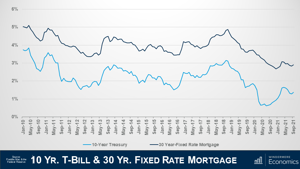
Slide is titled “10 year treasury bill and 30 year fixed rate mortgage” the information is sourced from Freddie Mac & the Federal Reserve. Two line graphs on the same graph. The X-axis shows dates from January 2010 to September 2021. The Y-axis is percentages starting at 0% and going up to 6%. The dark blue line represents the 30 year fixed rate mortgage, and the light blue line represents the 10-year treasury yield. Overall the chart shows that the treasury and mortgage rates track each other closely.


Here is a chart showing the average yield – or interest rate – on 10-year treasury bills by month going back to 2010 in light blue, and the average 30-year mortgage rate in dark blue. I hope that you can see the tight relationship they have to each other.

Of course, there are times when bond yields can go down and mortgage rates rise, and vice-versa but, in general, they track each other pretty closely.

And if you’re wondering why the rates aren’t simply the same, well it’s because a treasury bond has no risk – as its backed by the US government – but there is some risk associated with a mortgage, so buyers of mortgage bonds expect a premium to be added because of this risk, and this has averaged just over 1.5% since the 30-year mortgage came into being back in the early ‘70’s.

Now, there are some people out there who think that the interest rate on 10-year treasuries doesn’t set mortgage rates, rather its better to track the interest paid on mortgage bonds and, although I do see why they might think  this, the base mortgage rate is actually set by treasury yields and the interest on mortgage bonds is set using that base and adjusting it to manage the prevailing risk tolerance that investors are prepared to accept so I believe that watching movements in the interest paid on 10-year treasuries is the right way to go.

And that, in essence, is how the 30-year mortgage rate is set.

The History of Mortgage Rates

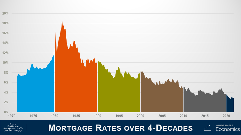
If you are a regular viewer of these videos you will now that I like to start off with some context to the subject I am addressing and this chart will show the average rate for conforming 30-year fixed rate mortgages going back to their genesis in the early 1970’s.


Slide is titled Mortgage Rates over 4 Decades and the information is sourced from Freddie Mac Average Rate for 30-year fixed mortgages. Area graph shows a timeline from 1970 to 2021 on x-axis and percentage rates on the y-axis from 0% to 20% at the top. The colors of the graph splits these dates into decades. Overall the graph peaks in the early 1980 above 18% and slowly trends downward until 2020 where rates are the lowest ever.


Back in ‘71 rates were in the mid-7% range, rising to just under 10% in ‘74, before pulling back but, as you can clearly see, they started to spiral upward in ’77, ending the decade at almost 13% and if you’re wondering what led to this massive jump, well this was because the country had entered a period of high inflation.

In the ‘70s the country was pushed into a recession basically due to an oil embargo that led to the price of oil quadrupling and that led to a period of so-called stagflation which is when inflation rises, and economic activity slows.

And in the early ‘80’s we entered a period of so-called hyperinflation, as another oil embargo was took hold and the Fed was forced to step in and raised short-term rates which led rates along the yield curve to rise and this – of course – included 10-year treasuries which hit 15.3% in the fall of 1981 and that, as we have discussed, caused mortgage rates to hit an all-time high in October of 1981 at close to 18.5%. Rates then started to pull back and

In the 90’s, rates started to trend lower but jumped again in ’94 as the Fed tightened monetary policy given the significant growth that the country was seeing, but they started to pull back in the second half of the decade, falling to the mid-6’s before notching higher in ’99.

In the 2000’s, rates dropped to 5.3% in 2003 as the housing market boomed but, as we all know, it wasn’t all unicorns & rainbows in this decade of what was then – historically low rates.

The housing crash led the Fed to jump in by cutting interest rates, but they also started a massive purchase of mortgage bonds at very low interest rates as they were happy to take a low return as long as it stabilized the housing market. As a result of their efforts, mortgage rates fell almost a full percentage point, averaging just a hair above 5 % in 2009.

Riding the wave of low bank borrowing costs, mortgage rates entered the new decade around 4.7% and continued to fall steadily, dropping to the mid-3’s by 2012. But in 2013 you can see that rates headed higher. Why? Well, a big part of this has to do with some panic in the bond market, but we will get to that shortly.

Anyway, rates went up in 2014 before dropping to 3.85% in 2015 as the market calmed down.

They rose again after the 2016 presidential election, reaching their peak at the end of 2018 and start of 2019, but still ending the decade below 4%.

As for the current decade, well, it’s all been about COVID-19.


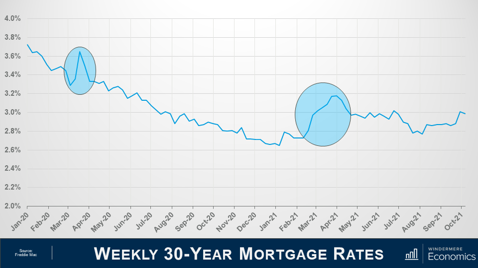
Slide is titled Weekly 30-year mortgage rates and the information is sources from Freddie Mac. Along the x-axis is dates from January 2020 to October 2021, and the y axis has percentages from 2% at the bottom and 4% at the top. 2 spots are highlighted, the first is in March 2020, a spike in mortgage rates at the beginning of the pandemic chaos. The other spike was in March 2021, due to a variety of factors explained in the main text and video.


To understand what’s happened over the past couple of years, we need to look at the weekly average rate and I am sure that you have noticed the first spike in the graph.

And it was totally due to the Coronavirus which created an unprecedented situation for all rates (not just mortgages, but US Treasuries and everything else).

You see, investors were panicking during the early stages of the pandemic, not just because the country – essentially – shut down for a brief period, but there were rumors about a thing called forbearance, and investors were panicking that they would not get paid for the mortgage bonds they held, and they did what we all do when we get worried about the economy and, specifically, our investments. They get out of their investment positions and into cash and that’s absolutely what they did, but I should add that I am not talking about them stashing dollars under the mattress.  No, they moved into cash positions in financial markets, which are the most liquid, nimble place an investor in the US can be.

And with a lot of institutions and individuals getting out of bonds and not many buyers out there, what happened to rates? That’s right, they rose to attract buyers and rise they did. So much so, in fact, that on a single day in March of 2020, mortgage bonds prices changed 5 times! Quite unprecedented.

Anyway, the Fed reverted to their old playbook and went on a massive bond buying spree with the biggest ever purchase of mortgage-backed securities on Thursday March 19 but, quite remarkably, they announced the very next day that they were going to buy even more.  How much more, you ask… Well, they decided to buy three times more than the record purchase they made just the day before!

And because of this, rates dropped dramatically and continued to pretty much head lower for the rest of the year and into early 2021.

But then the music stopped, as you can see in the second highlighted spike in the above graph.

You see, a special election was being held in Georgia and the bond market decided to take a conservative stance prior to the election and that led rates higher again. But the election wasn’t the only reason why rates rose.

You see, COVID 19 cases that were dropping, improved vaccine distribution appeared to be in place, there were several stronger than expected economic reports released, and progress on a fiscal stimulus package.  All of these factors led rates higher because, as you know, when economic news is positive, that is actually bad for bond yields as people move back into equities and out of bonds which is obviously bad for mortgage rates as bonds need to offer a higher interest rate to attract the few buyers that were out there.

Mortgage Rate Forecast

So that’s where we are today, but what of the future?


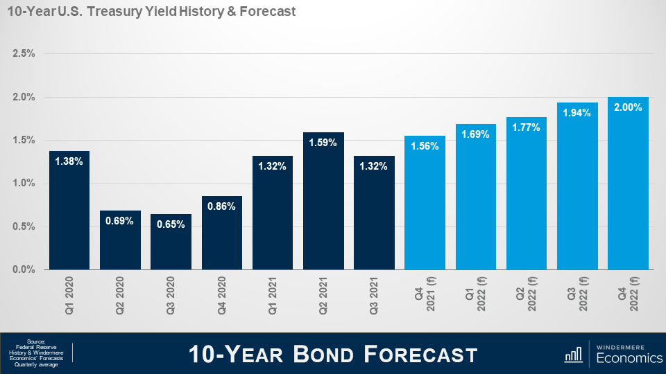
Slide titled “10-year bond forecast” sourced from Federal Reserve History & Windermere Economics Forecasts Quarterly Average. Bar chart shows the past 10-year US treasure Yield History quarterly from Q1 2020 to Q3 2021. These bars show a valley at the end of 2020 and trend upward in early 2021. The next set of bars show Windermere Economic’s forecast for the next 5 quarters, showing a steady increase each quarter until a high at 2% in Q4 2021.


Here is my forecast for 10-Year treasuries through the end of next year and you will see that I am looking for rates to rise gradually as we move into next year and this will lead mortgage rates to start notching higher as well.


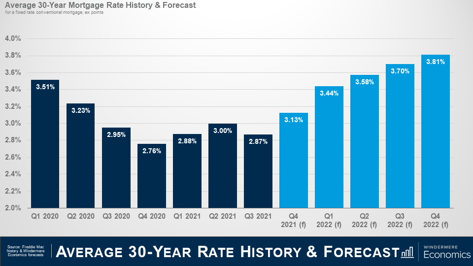
Slide titled “Average 30-year rate history and forecast” sourced from Freddie Mac history & Windermere Economic Forecasts. Bar chart shows the history of the average 30-year mortgage rate from Q1 2020 to Q3 2021, which show a quick decrease from Q1 2020 to Q4 2020, and a steady plateau in 2021. Windermere Economics forecasts a steady increase starting Q4 2021 until Q4 2022, ending at 3.81%.


And here is my forecast for mortgage rates. Although they should move higher, I am still not seeing rates break above 4% until 2023 at the earliest and – even as they start to increase – I really don’t see it as a major deterrent to home buyers.

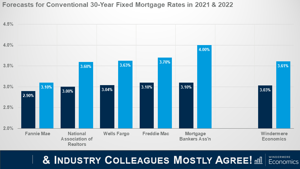
But before you start to say that this is only one person’s forecast and it could be wrong, lets look at my forecast compared to some of my industry colleagues.


Slide titled “ and Industry Colleagues Mostly Agree.” Bar chart shows the forecasts of Fannie Mae, National Association of Realtors, Wells Fargo, Freddie Mac, and Mortgage Brokers Association compared to Windermere Economic’s forecast.


As you can see, we are all in a pretty tight range when it comes to forecasting the average rate this year and next.

The bottom line is that although rates will rise, they will remain very competitive when compared to historic averages and the upward trend in rates is unlikely to have any significant impact on prices. That said, many markets are already having an affordability crisis and rising rates will certainly act as an additional headwind to price growth; however, it would take a significantly greater increase in rates to negatively impact prices.

Well, I hope that you have found this month’s discussion to be interesting. As always if you have any questions or comments about this topic, please do reach out to me but, in the meantime, stay safe out there and I look forward the visiting with you all again, next month.

Bye now!

BuyingMarket NewsSelling September 27, 2021

9/27/2021 Housing and Economic Update from Matthew Gardner

This video is the latest in our Monday with Matthew series with Windermere Chief Economist Matthew Gardner. Each month, he analyzes the most up-to-date U.S. housing data to keep you well-informed about what’s going on in the real estate market.  


Introducing Matthew Gardner, Windermere’s Chief Economist. Read on about what real estate updates he has for us this month.


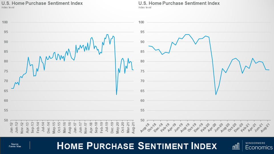
Today we are going to take a look at the latest Home Purchase Sentiment Index survey that was just put out by Fannie Mae. And for those of you who may not be familiar with this survey, it’s actually pretty important and one that I track closely as it’s the only national, monthly, survey of consumers that’s focused primarily on housing.


The survey shows the responses of 1,000 consumers across the country to roughly 100 survey questions on a wide range of housing-related topics. Now, don’t worry, we aren’t going to look at all 100 questions – just the ones that solicit consumers’ evaluations of housing market conditions and that also address topics related to their home purchase decisions.

Two line graphs side by side on a presentation slide titled “Home Purchase Sentiment”. On the Left is a graph showing the U.S. Home Purchase Sentiment Index Index Level from January 2021 to August 2021. From January 2021 to July 2019, there’s a slow increase from just above 65 to a peak just under 95. In May 2020 however, there’s a sharp valley that dips between 60 and 65. On the right shows the last three years where the Pandemic induced drop is more clear. The drop in sentiment index lasted roughly from February 2020 to August 2020, and has held relatively stable ever since, sitting between 75 and 83.


So, as you can see here, the overall index was trending higher pretty consistently until the pandemic happened which had massive, but temporary, impacts. And looking the last 3-years, you can get a better idea as to the speed of the pandemic induced drop – pretty remarkable.

Now, you will also see that the index recovered quite quickly; however, it fell again last fall as the pandemic was not going away at the speed many had hoped for – it rose again this spring but has been pulling back for the past few months but, that said, the August index level essentially matched the level seen in July.

Now let’s look at the questions that are used to create of the index number and how consumers responded.


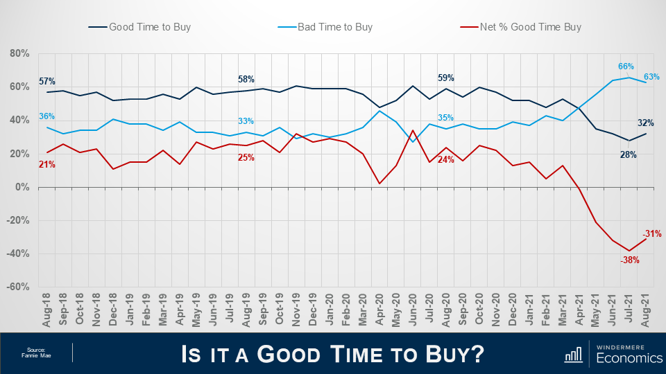
Three lines on the same graph on a slide titled “Is it a Good Time to Buy?” which shows sentiment compared to those who think it’s a good time to buy and those who think it’s a bad time to buy. The graph’s x axis shows the percentage of respondents and the y axis shows dates from August 2018 to August 2021. The navy line indicates “Good Time to Buy” the light blue indicates bad time to buy, and the red indicates the net percentage good time to buy. The navy line sits above the other two lines for the most part, but it dips below and switches places with the light blue line in April 2021. The net share of those who say it’s a good time to buy jumped 7%, which is the first time it’s improved in the last four months.


When asked whether it was a good time to buy a home, the percentage who agreed with that statement rose from 28 to 32%, while the share who thought that it is a bad time to buy dropped from 66 to 63%. And, as a result, the net share of those who say it is a good time to buy jumped 7 points month over month and its notable that this is the first time the net share number has improved in the past 4-months.

What I see here is that – although improving modestly, the general consensus is that it is not a good time to buy and that sentiment is being driven by two things: One – there are still not enough homes on the market, and two, rapidly rising prices are scaring some people.


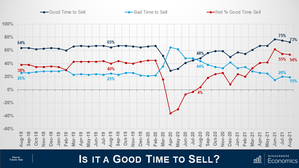
Three lines on the same graph which shows seller sentiment. The presentation slide I titled “Is it a Good Time to Sell? The graph’s x-axis shows percentages from -60% to 100% and the y-axis shows thedates from August 2018 to August 2021. The navy line represents those who think it’s a good time to sell, the light blue line indicated those who think it’s a bad time to sell,and the red line indicates the net percentage of people who think it’s a good time to sell. The navy line is mostly on the higher end, sitting in the 65% range, until March 2020 when it flips with the light blue line. They switch back in August 2020 when they are 48% and 44%. The different grows in the last few months, landing at 54% net difference in August 21.


And when asked if they thought it was a good time to sell their homes it was interesting to see that share drop from 75 to 73% while the percentage who said that it’s a bad time to sell dropped 1 point to 19% and as a result, the net share of those who said it was a good time to sell pulled back by 1% but it still indicates that more owners think that it is a good time to sell than don’t.


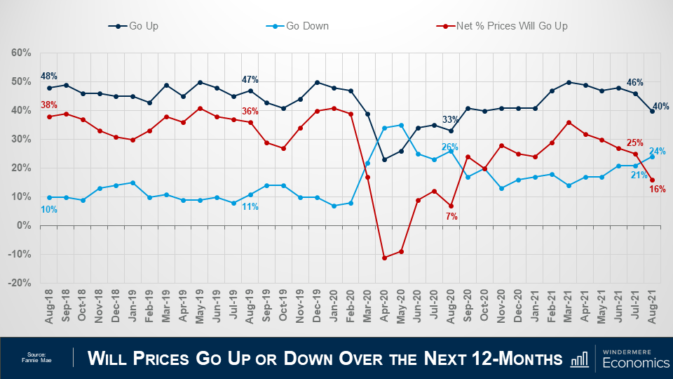
Three lines on the ame grah to compare different sentiments about whether home prices will go up in the next 12 months. The slide is titled “Will Prices Go Up or Down Over the Next 12-Months” and the x-axis shows the percentage of respondents from -20% to 60%, and the y-axis shows the dates from August 2018 to August 2021. The navy lineindicates the respondents who thinkprices will go up, the light blue line shows the respondents who think prices will go down, and the red line shows the net percentage difference. In August 2021 net share of Americans who say home prices will go up dropped by 9 points – from 25%, down to 16%.


Looking now at the direction of home prices over the next 12-months, the percentage who think that home prices will rise fell from 46 to 40%, while the percentage who expected home prices to drop rose from 21 to 24%.

As a result, the net share of Americans who say home prices will go up dropped by 9 points – from 25%, down to 16%.

Although this may sound concerning, I should add that the share of respondents who thought that home prices will remain static over the next year rose from 27% to 31%.


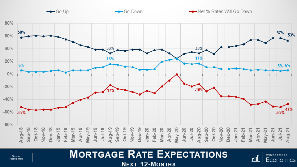
Three lines on the same graph comparing the different expectations of people considering the mortgages rates of the next 12 months. The slide is titled “Mortgage Rate Expectations for the Next 12-Months” and the graph’s x-axis goes from -80% to 80% and the y axis shows dates from August 2018 to August 2021. The navy line indicates respondents who think mortgage rates will go up, the medium blue line shows those who think mortgage rates will go down, and the red lines shows the net percentage rates will go down. Most people think rates will go up. The net share of Americans who believed that mortgage rates will go down over the next 12 months rose by 5%


On the financing side, the share who think mortgage rates will rise over the next 12 months dropped from 57 to 53%, while the percentage who believed rates would be lower rose from 5% to 6% and, as a result, the net share of Americans who believed that mortgage rates will go down over the next 12 months rose by 5%, and with 35% of respondents thinking that that rates will hold steady – it’s clear to me that a vast majority are not worried about mortgage rates rising.

The takeaways for me so far are that consumers tempered both their recent pessimism about homebuying conditions and their upward expectations of home price growth.

Most notably, a greater share of consumers believe that it’s a good time to buy a home – though that population remains firmly in the minority at only 32% – while the ongoing plurality of respondents who expect home prices to go up over the next 12 months dropped but was still well above the 24% of consumers who believe home prices will fall.

Now, there are two more questions that are worth looking at which aren’t directly related to home buyers and sellers but are still important as they look at employment and incomes.


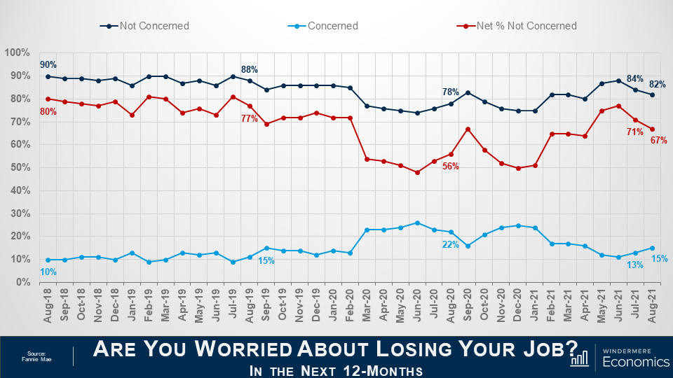
Titled “Are you worries about losing your job in the next 12 months” three lines on the same grph show the comparison of respondents between Augut 2018 and August 2021. The navy line represents the respondents who are not concerned, the light blueline shows those who are concerned, and the red line shows the net percentage not concerned. The net share of Americans who say they are not concerned about losing their job fell by 4 percentage points month over month, but remains well above the level seen a year ago.


The percentage of respondents who said that they are not concerned about losing their job in the next 12 months remains very high at 82%, but it did drop by 2 points month-over-month, while the percentage who said that they are concerned ticked up to 15% from 13%. As a result, the net share of Americans who say they are not concerned about losing their job fell by 4 percentage points month over month, but remains well above the level seen a year ago.


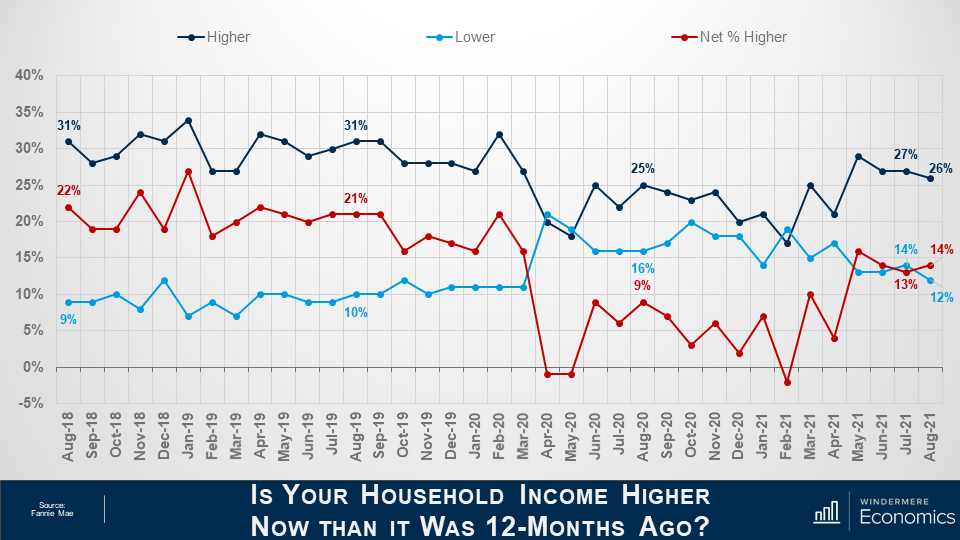
This slide is titled “Is your household income higher now than it was 12-months ago?” the graph has 3 lines on it comparing different responses from the survey. The x-axis goes from -5% to 40% and the y-axis shows the dates from August 2018 to August 2021. The navy line indicates respondents who reported a higher income, the light blue indicates those with lower income and the red line shoes the net percentage who have higher income. The navy line is mostly the largest portion staying on the top of the graph, but it dips below the light blue line in April 2020, May 2020, and February 2021. The red line say a 1% increase in the last month, but rose from 9% in August 2020 to 14% in August 2021.


And finally, when households were asked about their own personal finances, the percentage of respondents who said that their household income is significantly higher now than it was 12 months ago pulled back one point to 26%, while the percentage who said that their household income is significantly lower dropped to 12%.

As a result, the net share of those who said that their household income is significantly higher than it was a year ago rose by 1 percent month over month and came in 5 points higher than a year ago. It’s also worthwhile noting that most said that their household income is about the same as it was a year ago with that share rising from 56 all the way up to 59%.


Looking at all the numbers in aggregate, the index level was relatively flat in August with three of the index’s six components rising month over month, while the other three fell, and that tells me that the continued strength of demand for housing and definitely favorable conditions for home sellers may well be offsetting broader concerns about the Delta variant of COVID-19 as well as rising inflation that have both negatively impacted other consumer confidence indices.

Most consumers continued to report that it’s a good time to sell a home – but a bad time to buy – and they most frequently cite high home prices and a lack of supply as their primary rationale.


However, the ‘good time to buy’ component, while still near a survey low, did tick up for the first time since March, perhaps owing in part to the very favorable mortgage rate environment as well as growing expectations that home price appreciation will begin to moderate over the next year. A sentiment that I personally agree with.

Well, I hope that you have found this month’s discussion to be interesting. As always if you have any questions or comments about this topic, please do reach out to me but, in the meantime, stay safe out there and I look forward the visiting with you all again, next month.


Bye now!